Hans Rosling’s Gapminder World is a fabulous initiative to make the dry, arcane world of global statistics more accessible for us mere mortals. Instead of obtuse tedious charts, spreadsheets and PDFs from the UN, UNESCO etc, he’s created a colourful, animated and easy to manipulate application which shows you more than a mere set of numbers ever could. It’s lovely.
Governments should be forced to deliver all global statistics in this engine from now on, so we can see what’s really going on. Tell you what though, I wanna know what makes Luxembourg so rich? Check out his TED talk.
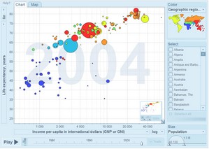
You’ve never seen data presented like this. With the drama and urgency of a sportscaster, Hans Rosling debunks myths about the so-called “developing world” using extraordinary animation software developed by his Gapminder Foundation. The Trendalyzer software (recently acquired by Google) turns complex global trends into lively animations, making decades of data pop. Asian countries, as colorful bubbles, float across the grid — toward better national health and wealth. Animated bell curves representing national income distribution squish and flatten. In Rosling’s hands, global trends — life expectancy, child mortality, poverty rates — become clear, intuitive and even playful.


mentalfloss posted a similar web service this morning that is much less visual, but constantly updating in realtime. it brings a kind of shot clock desperation to the numbers, like those roadside signs that count total smoking deaths so far this year etc. interesting to see that there are so many other stats junkies out there…