I’m really getting tired of badly designed sign up forms. I spend a lot of time subscribing to various services, applications and stuff, and it’s amazing how many subscription forms are still really really rancid. Please web developers, take a course in form design UI or something, and stop wasting our time and brainpower. Specifically I cannot stand –
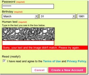
- Forms that display indecipherable captchas that you can’t read, contain both zero and the letter O, and thereby trap you in an endless refresh-fail hell!
- Forms that ask for a password plus a confirmation of the password, then clear the confirmation box if the form submit fails for any reason.
- Forms that don’t tell you what format you need in each entry box, then fail you right at the end of the process with lots of pretty red text!
- Forms that keep the password format a secret and fail when you naturally forget to enter the 3 numbers, 6 letters (two capitals) and an ancient Egyptian hieroglyph.
- Forms that send me to a totally separate page containing 3 lines of text when I click on the little ? help button.
- Forms that erase one or more of the text boxes on fail every single time, so you have to re-enter the information again and again and again and…
- Multi-page forms that won’t let you backup to correct a simple mistake, so you have to start all over again from the beginning.
- Forms that don’t contain international country drop down boxes. Or even realise that there is a world out there beyond Poughkeepsie.
- Forms that make me click on some stupid hidden ‘Agree’ button buried deep at the bottom of a T&Cs frame. Yeah that’ll make me read the stuff all right.
- Forms which make me wait x seconds before the submit button goes live. Yeah that’ll make me read the Terms and Conditions too. Sure it will.
- Forms which ask me 40 stupid, unnecessary questions like the height of my pet rabbit, name of my favourite lamp-post and the capital of Algeria, when all I want to do is buy a ball point pen.
- Forms that demand I enter some totally unmemorable fact like my aunt’s sister’s middle name as my security question.
- Forms that make a US State a required field even when you enter another country as your domicile.
- Forms that do not give you any clue at all as to why you have failed to enter the information correctly. AKA the mind reader conundrum.
Worst offenders in my opinion? Airline sites, closely followed by financial institutions (who seem to have literally transferred over many of their 1960 IBM mainframe forms and given them a bit of colour and a logo) and small mom and pop stores who are using badly designed shopping cart scripts that have never been updated. Oh and a few of the web hosting sites.


I can totally relate to the forms problem. I think we’ll go back and look at the few forms we have on our site and look for ways to improve the user experience. It’s been a serious focus recently.
Unlike you, I tend to skip sites that complicate the signup process. There are so many sites that offer similar services I often just go to the next.
Red, do you think you can do a follow up post with forms you like? I would love to see your opinion of what works.
Nicely put, Red.
I share your pain, particularly with point 6.
Red,
It’s like you’ve been reading my mind. I’m constantly filling out online forms for my job (I do research) and I’ve stumbled across every one of these issues over and over and over.
I’d love to hear what your thoughts on forms that work for you.
Great article.