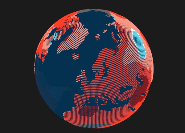
Global warming is already affecting us all. The planet is warmer than it was 50 years ago. That’s not a good thing! Although it may not seem that bad, we’re already facing the effects of extreme heat and water and food shortages around the world. If you’re still in doubt, see how the future temperature looks in your part of the world with this interactive map.
This map gives the data on how a nearby city is faring with climate change. What the temperatures were like and where they are likely to go. It shows this in two graphs that are easy to read. The site also explains the methodology and where the data came from.
You can’t get your exact location, there were only 1000 cites profiled but you should be able to get pretty close as they are all across the world. Check out the website to see how things are going to be if we don’t start making some changes.


