Somewhere, in an alternate universe far away in space time, there’s a world where the invention of the World Wide Web stalled and never moved on from 1992. In that universe, people developed websites with all sorts of fancy navigation, services and functionality, but the only tool you could use to access it was the Lynx Web Browser, the oldest browser still in use. What does that online world look like to those user? We have the answer.
In this world, this is how you would navigate a few of the world’s largest websites using nothing more than your arrow keys, the Enter key and + and – for page up and down. Forget about an address bar, you’ll need to become very friendly with a third party search box instead. In this case we used Google.
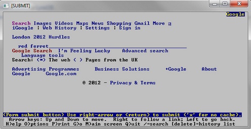
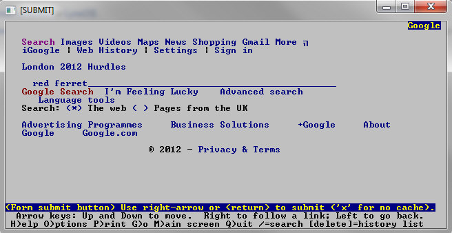
Google – strangely enough, Google looks much more complicated than you would imagine. And scrolling down to a non-existent search box with your arrow keys takes a while to work out. A world without fancy buttons also turns everything into a link, so remember to Google Search once you’ve entered in your search term.
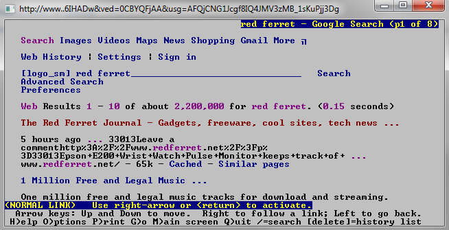
Results are a little scrappy too, and you could spend a while scrolling through the first page, let alone 12 million results.
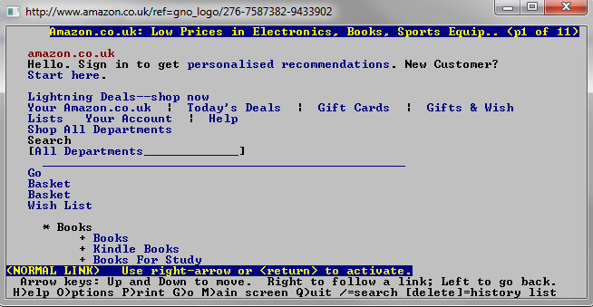
Amazon – Wow, Internet stores are going to have problems attracting customers if they have to click through this many links to get to their product of choice. And forget about paying, there’s no way to get into your basket at all.
BBC – Thank goodness for the BBC. Easy and quick to browse and navigate, you can be engrossed in the news and entertainment content in seconds, and more to the point it’s all clearly signposted. A huge win for old Auntie.

CNN – It looks as though the news sites have it much easier. The venerable CNN site also comes out with a solid performance under steam power, although you’ll spend a fair amount of time using your arrow key to get past the linear menu links on news content pages. No pics of course, because this is strictly a text only world.

Huffington Post -Alas poor Huffington Post. Lots of lovely clean menus and story titles, but a disastrous ‘bad HTML’ and no news stories at all when you click. Looks like they’ve broken something fundamental in their search for a better user experience. Not even the mobile version delivers a story. Total fail.

Yahoo! – Once you’ve spent a few moments agreeing all their cookie requests, you’ll find yourself faced with a surprisingly well ordered page of information. At the top, where you’d expect it, the search engine bit, scroll down and you’ll find all the various content areas neatly laid out and very accessible. Unfortunately there’s a lot of menu links to wade through before finding the meat of the news stories underneath.
So there you have it, a modern world seen through an Alice peephole from a forgotten era. We’ve come a long way since those days. Or have we?


“I surf faster than you do, monkey boy. (My take on Netscape vs. Lynx)”
Lynx still is my primary browser (assuming you don’t count my Android phone).
Unlike you, I had no problem accessing HuffPo, possibly because I run Lynx with cookies off most of the time. The other possibility is that some sites do weird shit based on User-Agent, so my Lynx command line has this:
-useragent ‘Lynx/2.8.6’
Use the space bar for faster scrolling through pages.
Amazon offers a “mobile/accessibility” option that shows up on this link when I hit their main page:
[1]A different version of this web site containing similar content optimized for screen readers and mobile devices may be found at the web address: http://www.amazon.com/access