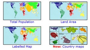
There’s no reason why maps should be boring, and Worldmapper proves it. The idea is to deliver a range of maps – over 700 in fact – which reflect interesting datasets, rather than just supplying bland generic information.
So for example there’s a map which focuses on population and has a bloated Asian section and a skinnier Europe and US to reflect the different population densities. It’s a clever way to grab a quick visual overview of a dataset. There are also animated maps on the site which are fascinating (click on the Income one for a bit of an eye-opener).
Worldmapper is a collection of world maps, where territories are re-sized on each map according to the subject of interest. There are now nearly 700 maps. Maps 1-366 are also available as PDF posters. Use the menu above to find a map of interest.


